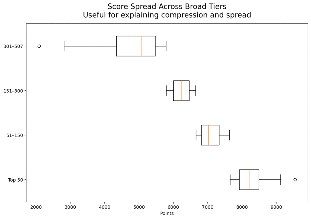
A ranking table often tempts readers into binary thinking. They look at the top and the bottom and assume the story is one of winners and losers. But when you examine the distribution of scores in the 2026 edition of HE Higher Education Ranking, a different picture emerges. The scores run from roughly 2092 to 9543, with a median just above 6054 and an average just above 6036. That is not a story of a tiny elite and a failed majority. It is a story of gradients—different levels of readiness, consistency, evidence quality, and institutional maturity.
This matters because it changes how universities should interpret their placement. A university in the middle of the table is not necessarily mediocre in any simple sense. It may be doing many things well while struggling with integration, communication, or public evidence. Likewise, a university near the top is not necessarily perfect. It may simply be more coherent across dimensions. Rankings become much more useful when they are read as performance landscapes rather than moral verdicts.
The score distribution also suggests that there is substantial room for mobility. When the middle of the table is dense, even modest improvements in documentation, visibility, and internal alignment can lead to meaningful movement. This should encourage institutions. Not every advance requires a decade of transformation. Some advances come from better coordination between offices, clearer public presentation of achievements, stronger data discipline, and more deliberate strategic communication. These are achievable improvements.
Another interesting feature of the distribution is that it reveals compression in certain zones and separation in others. The very top tier shows sharper differentiation, which is what one would expect when institutions are competing at high levels of overall coherence. But across many middle bands, the distances are more interpretable as developmental differences than as existential gaps. This is an important psychological point. Universities should not read a ranking result and immediately imagine themselves trapped. Most are not. Many are simply under-optimized.
This is why I often say that a ranking is best used diagnostically rather than theatrically. Institutions should ask: Are we lower than we should be because our substance is weak, or because our systems are poorly organized? Are we performing strongly overall but leaving points on the table due to communication gaps? Are our achievements invisible because they are scattered across units? Those questions are much more helpful than emotional reactions to position alone.
The 2026 score distribution also underlines something else: institutional diversity is real. The participating universities do not all begin from the same historical base. They do not share the same resources, scale, language environment, policy regime, or digital maturity. Yet they still appear within the same comparative space. That means the distribution should not be read as a crude hierarchy of worth. It should be read as a map of current institutional configuration.
For policymakers and quality leaders, this is extremely valuable. It allows them to identify clusters rather than just champions. They can see where universities are bunched together, where system-level support may be needed, and where certain institutions are breaking ahead. It also helps national systems move away from anecdotal self-perception. Instead of assuming strength or weakness, they can observe distributional reality.
So when people ask what the score distribution means, my answer is simple: it means that higher education is not divided only into stars and strugglers. It is structured by gradients of readiness. Some universities are already highly integrated and externally legible. Others are promising but fragmented. Others are energetic but inconsistent. Others are still building their evidence culture. The ranking makes those differences visible, and that is precisely why it matters.
This gradient-based view also improves institutional morale. When staff see the ranking only as a winner-takes-all ritual, many disengage. But when leadership explains that the result reveals a developmental position rather than a fixed destiny, the conversation becomes more constructive. People can identify specific areas for progress. Units can see how their work contributes. The ranking becomes something that can be used rather than merely feared.
There is a strategic advantage here too. Institutions that understand they are operating in a dense middle band can prioritize improvements with relatively high leverage. Better evidence structure, more coherent strategic presentation, cleaner digital architecture, and more visible documentation of partnerships or academic achievements can alter how the university is read. This is especially important because some of the most consequential gains are not always resource-intensive. They are coordination-intensive.
So the right way to read the distribution is with humility and possibility at the same time. Humility, because the table reveals genuine variation in institutional coherence. Possibility, because much of that variation is actionable. Universities are not simply placed. They are positioned within a landscape that they can work to change.
#HigherEducation #HERanking #UniversityRankings #DataInHigherEducation #InstitutionalReadiness #AcademicStrategy #QualityCulture